ITMO Design System
An inherited design system supporting the Edita CMS platform
From a fragmented UI kit to a structured design system
I restructured ITMO’s design system around components, token semantics, documentation and shared rules for design and engineering handoff.
ROLE
System architecture · Documentation · Token semantics · Design review


FileUploader
TOKEN SEMANTICS
NIGHTDAY / PRIMARY / VIOLET · BLUE · GREEN
30+
documented components · public catalogue
500+
design tokens


01
Evolving an inherited system
ITMO already had a design system, but it functioned more like a UI kit. Component structures, documentation and usage rules were inconsistent.
I started by designing individual components and gradually took responsibility for the system’s architecture, evolution and design quality.


Defined / initiated
Component-page model · Property vocabulary · Token approach and semantics


Led / reviewed
System quality · Documentation consistency · Designer guidance · Implementation review
Team-produced
I led component design and maintenance, designing some components myself and reviewing the work produced by the team.


Shared with engineering
Specifications and design–engineering handoff
The system supports Edita, a university site-building platform with 50+ live websites
02
Component-page structure and shared properties
I defined how component pages are organised and how properties are named
Component page
↓





Main component
Supporting components → Main
Properties & variants


Property examples
State · Size · Theme etc.
Component-specific properties


Documentation
Behaviour and edge cases for developers
Prototypes
SHARED PROPERTY LANGUAGE
Theme · State · Size · Mode / Type / Form
Visibility booleans · Editable text · Icon swaps


Add component-specific properties when shared names do not cover the need
Rules authored and maintained in Confluence; observed across multiple component pages
03
Button: from static examples to configurable properties
The inherited Button offered few configuration options. Its documentation focused on examples and construction details, including basic spacing
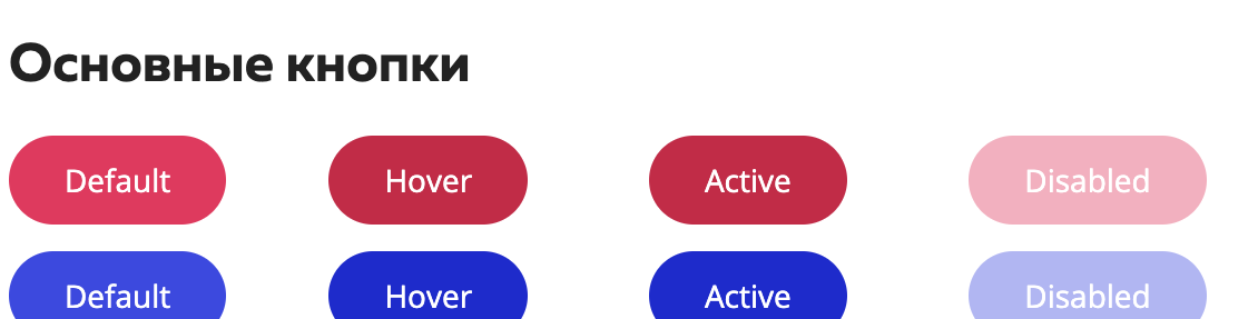
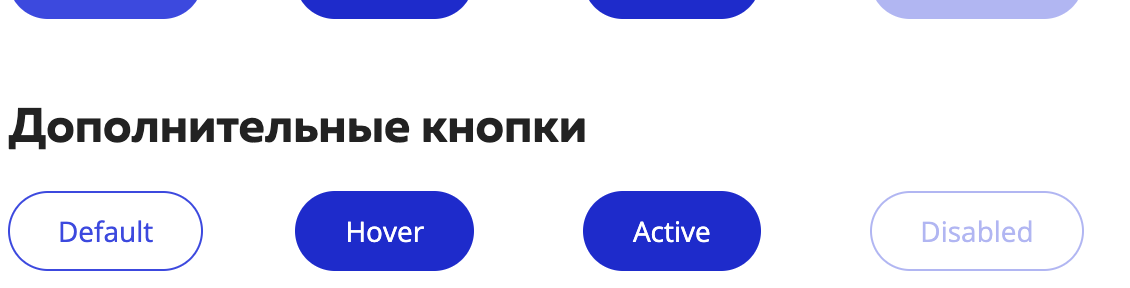
The evolved Button adds independent properties for theme, mode, priority, state, size and form, expanding how it looks and behaves
Legacy
Limited configuration · Example-led documentation























Current
FULL CONFIGURATION MODEL
Theme · Mode · Priority · State · Size · Form
Representative source examples · Priority / State / Size
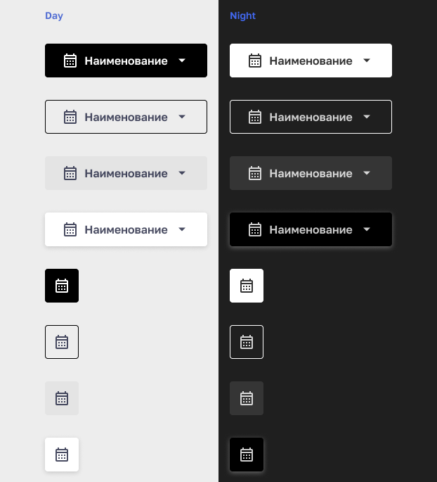
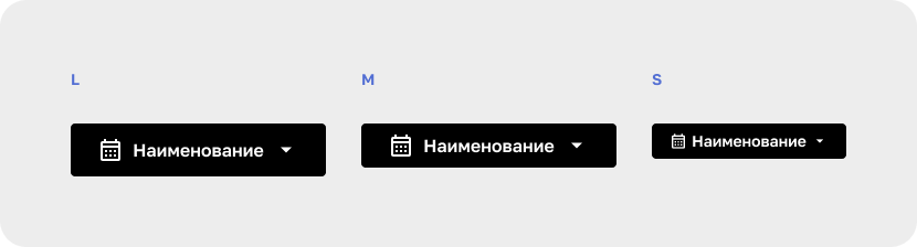
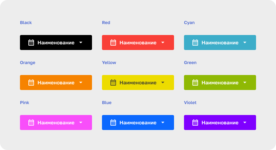
Shared states remain, while independent properties expand configuration, appearance and behaviour
04
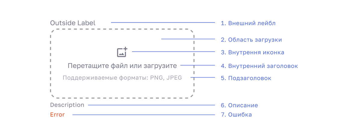
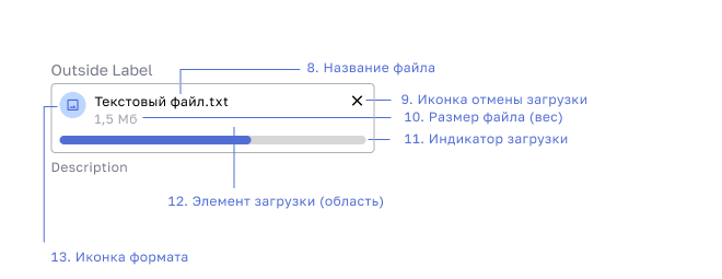
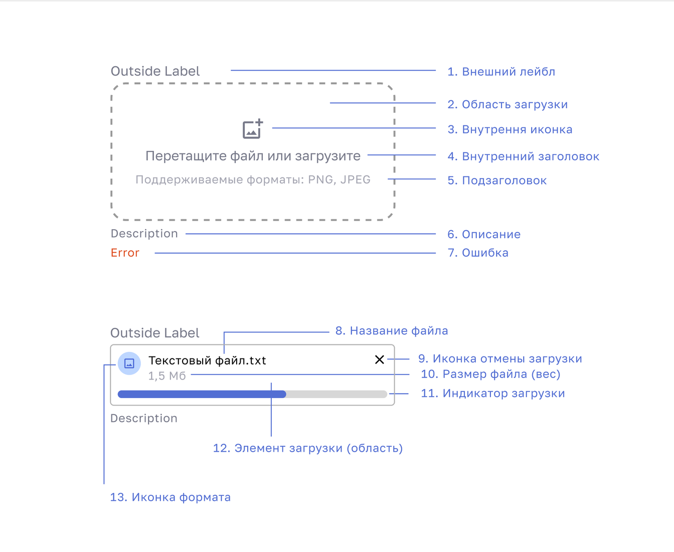
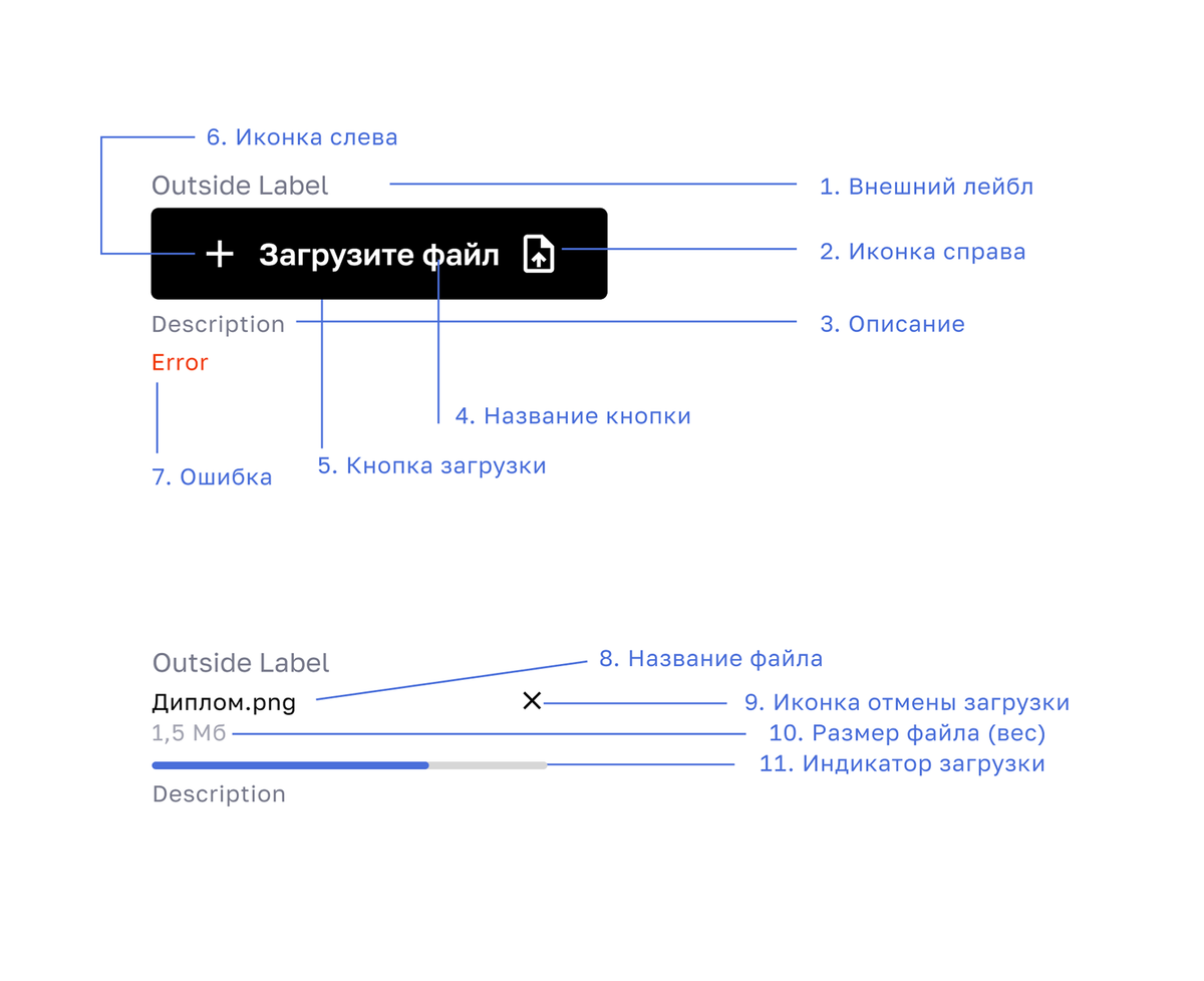
FileUploader: anatomy and valid configurations
Using FileUploader as an example, I defined the component structure, supported states and documentation model.
This helps designers configure variants and developers understand their behaviour.
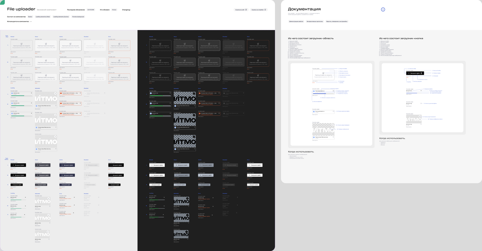
Main component · Day/Night variants · Documentation
Field: galleries, site badges and backgrounds
Button: logos, icons and favicons
Configuration axes
Theme
Day / Night
Mode
Field / Button
Size
L / M / S
State
Default / Hover / Active / Disabled / Error
Loading
None / In Progress / Uploaded
108 valid combinations in the main set · In Progress uses Default only; Uploaded supports Default, Error and Disabled
System architecture and design review, with component production shared across the design team
05
Behaviour and implementation edge cases
Transitions and edge cases are part of the component contract
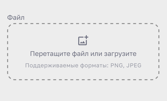
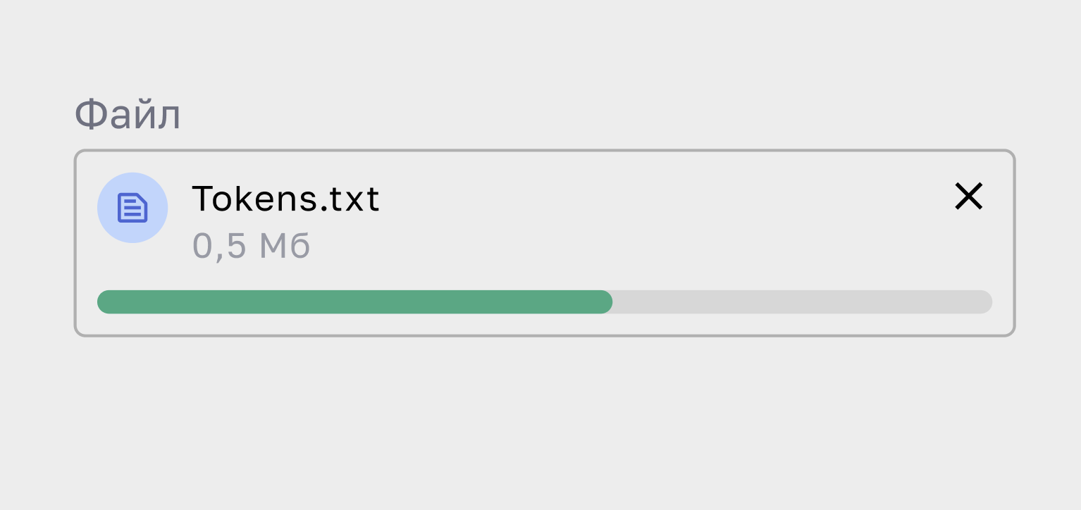
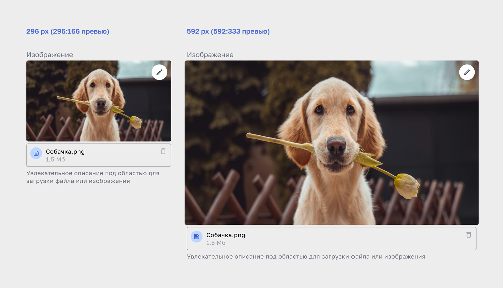
The documentation covers upload progress, successful completion, deletion, error and reset states, as well as precise layout rules such as middle truncation for long filenames and a 16:9 preview ratio
SUCCESS PATH
Initial → In Progress → Uploaded → Deleted
01 / Initial
02 / In Progress
03 / Uploaded
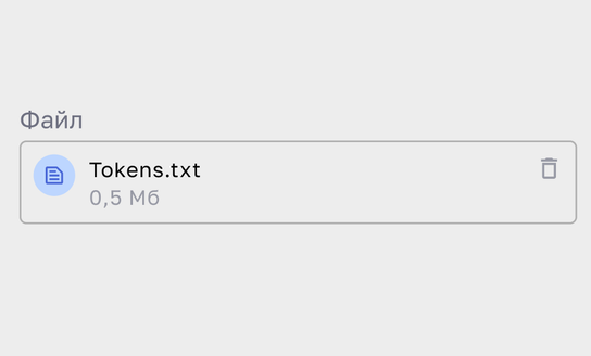
04 / Deleted
ERROR PATH
Error → Reset
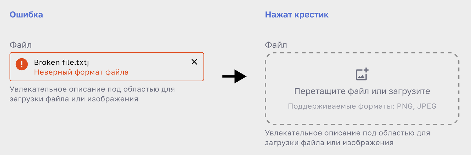
Documented prototype states · static source evidence
Long filenames Keep the beginning and extension visible.
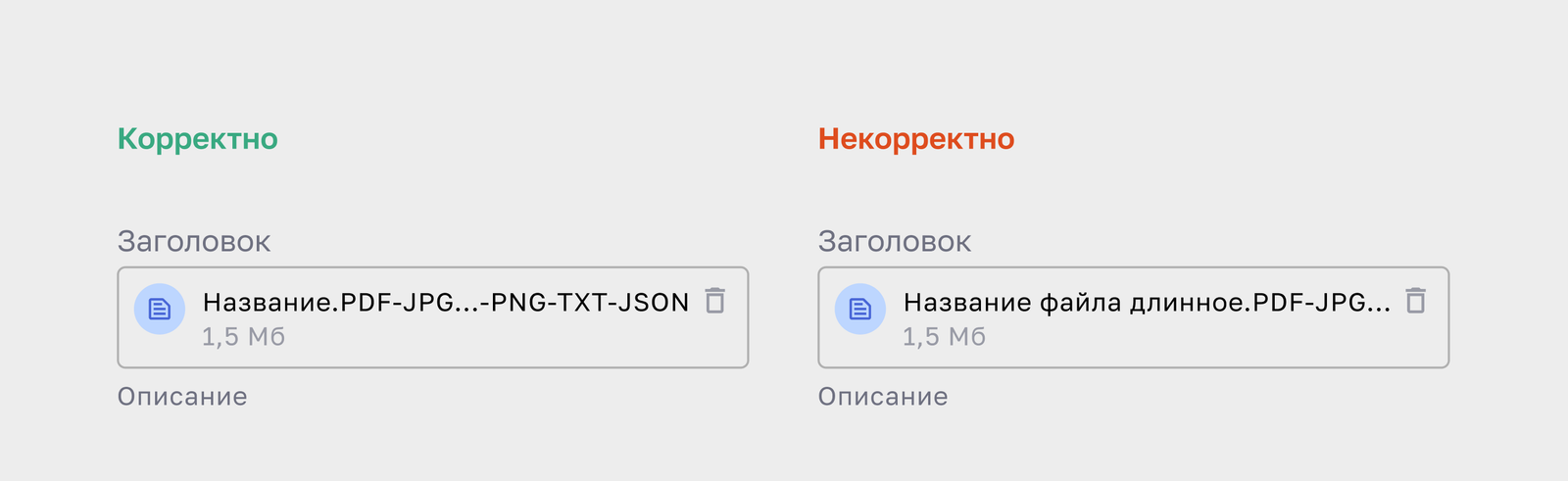
Preview ratio: 16:9
Documented examples: 296 / 592 px. Minimum Field width: 296 px; the component stretches to its container
16 : 9
06
Token families, semantics and exact values
I introduced a token layer to give raw styles shared names and reusable values
I defined themes, roles and scales, tested workflows and agreed the JSON handoff with developers
THEME COLLECTIONS

Day
Base

Static
Status · Text & Icons · Bg&Stroke
Dynamic
Role / state values
Primary
Hue / interaction state
Secondary
Hue / Light–Dark / intensity


Night
Base
Static
Status · Text & Icons · Bg&Stroke
Dynamic
Role / state values
Primary
Hue / interaction state
Secondary
Hue / Light–Dark / intensity
Visually impaired
Palette sets
GLOBAL
font
border
elements


500+ design tokens across themes, colours, typography and layout
TOKEN EXAMPLES
Colour and accessibility
day/primary/blue/default
#006AFF
day/primary/blue/hover
#1C8CFF
day/primary/blue/active
#1362BA
day/secondary/blue/light/10
#E4EFFF
day/secondary/blue/light/20
#CBE2FF
day/secondary/blue/light/30
#AED2FF
Typography and layout
font/Families/Body
Golos
font/Style/Desktop/Body/M
16px / 24px
border/radius/x1
8px
elements/height/L
48px
elements/spacing/padding/x2
16px
elements/spacing/gap/x3
24px
Named tokens give design specifications and engineering a shared reference for colours, typography and layout
07
Two artefacts for design–engineering handoff
Component specifications and exported JSON tokens give designers and developers shared definitions for behaviour, properties and visual values.


Design-system
semantics



Component specifications
Token JSON transfer artefact



Engineering implementation
Documentation also records dependencies, authors, update dates and change history
I shaped system semantics, documentation and handoff, and reviewed implementation with engineering
08
Shared rules, design review and a changelog
I established documentation rules, led design review and made component changes traceable
Rules
I defined a component-page structure and shared property names, with extra properties for component-specific needs


Design review
I led design review and documentation quality, working with designers on component production and maintenance
Changelog
Component changes are recorded with authors, update dates and dependencies
09
A shared foundation for product work
I brought component documentation, property names and token semantics into a shared structure for design and engineering
System foundations
Component architecture, documentation rules and named tokens form a reusable design foundation
50+ live Edita sites
The design system provides shared interface rules for Edita, a platform used by university teams to build and publish websites.


Leadership
Design Operations
How I reorganised the design team’s workflow, reduced multitasking and started measuring the results.

Observational comparison of different features and periods; Review includes queue and waiting
Let’s work on something complex
Open to Senior Product Designer and hands-on Lead Product Designer opportunities
Stanislav Koltyshev

koltystudio@gmail.com