Edita
Designing Edita’s interfaces from the ground up
I designed the interfaces for Edita, ITMO University’s CMS powering 50+ websites. I continue to improve the product through UX research, usability testing and collaboration with developers.
SCOPE
UX/UI · Research · Design Systems · Design–Engineering collaboration
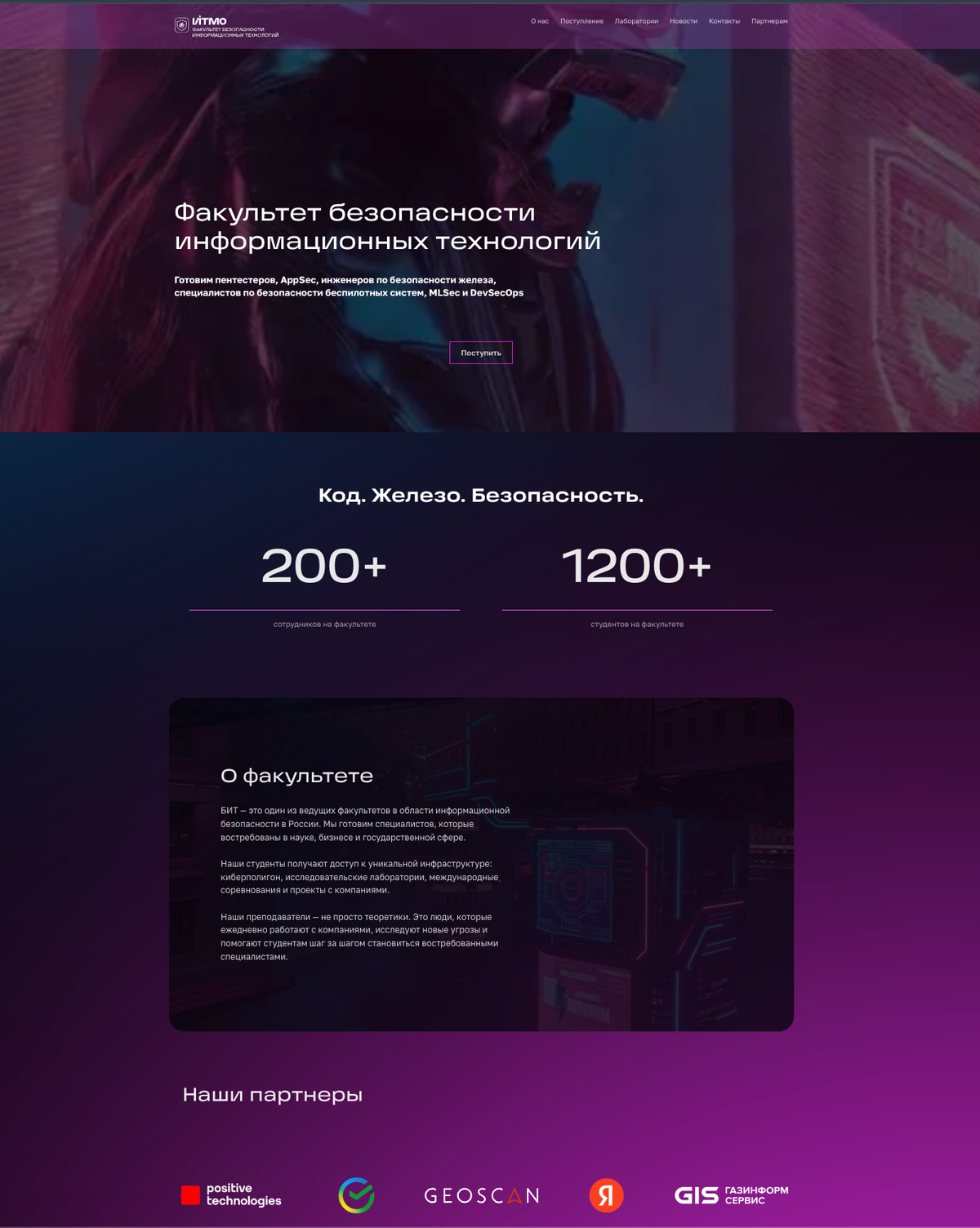
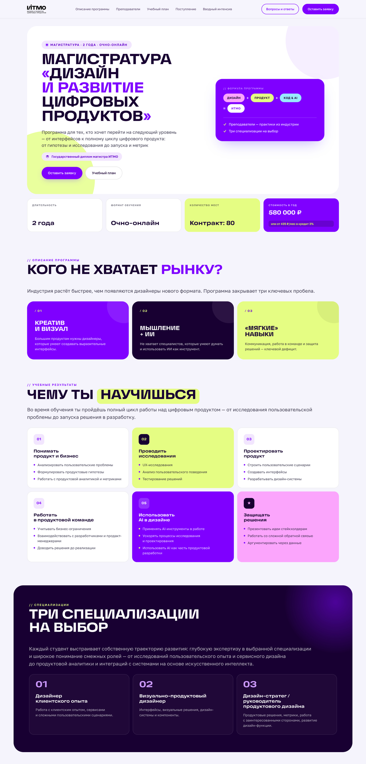
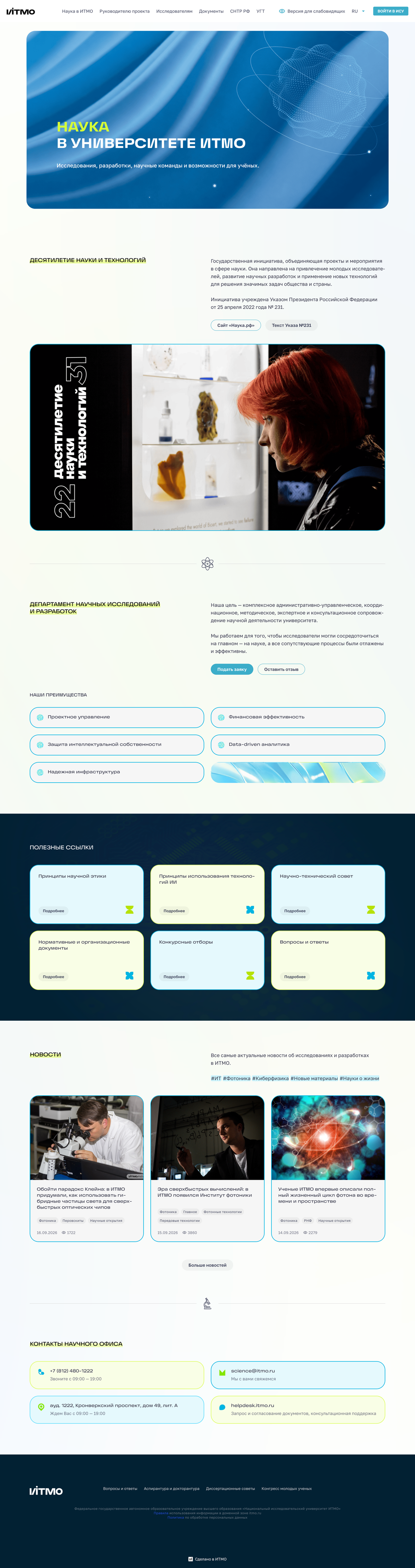
A centralised CMS and site builder
Edita is ITMO’s centralised CMS and site builder, created to unify publishing, visual standards and integrations across a fragmented web ecosystem
Two product decisions, with clear ownership
Design responsibility
I owned UX/UI decisions, interaction design, UX research and feature design. I led design review, design quality and implementation collaboration.
Shared decisions
I collaborated with product management, frontend, backend and design. Broader product direction, prioritisation and planning were shared.
Nested Pages
IMPLEMENTATION PENDING
Proposed and tested a simpler page hierarchy
Accent Architecture
SHIPPED
Separated site accents from block styling
Nested Pages
Editors had to navigate technical CMS structures before they could work with content.
RECURRING QUALITATIVE SIGNALS
Site reviews and support cases revealed confusion around sections, homepage settings and nested pages.
Recurring observations from site reviews and support cases.
The existing model exposed a separate “section” entity alongside pages
To create nested content, editors had to create a section, configure it, create pages inside it and assign a homepage
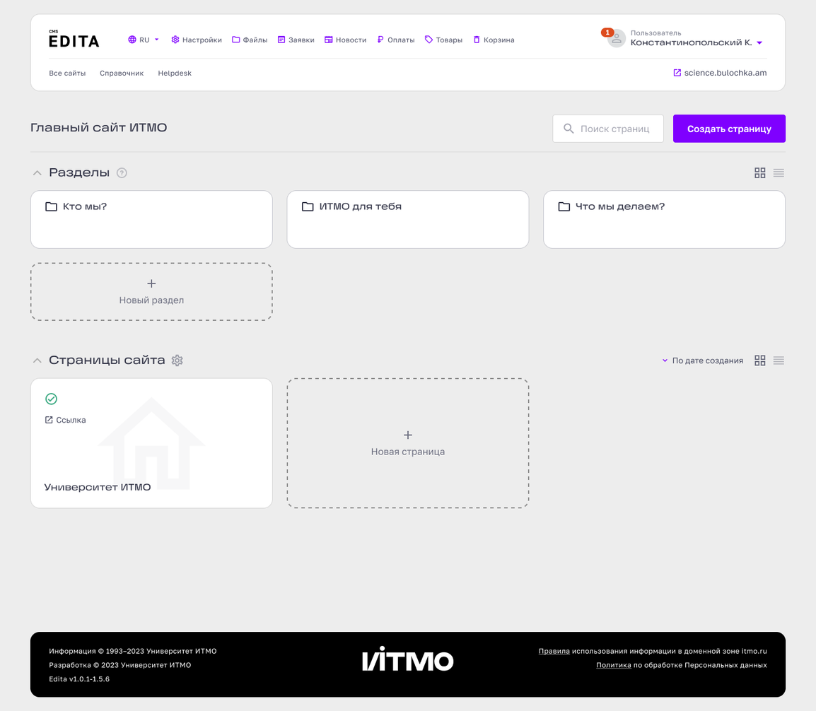
Separate section entity
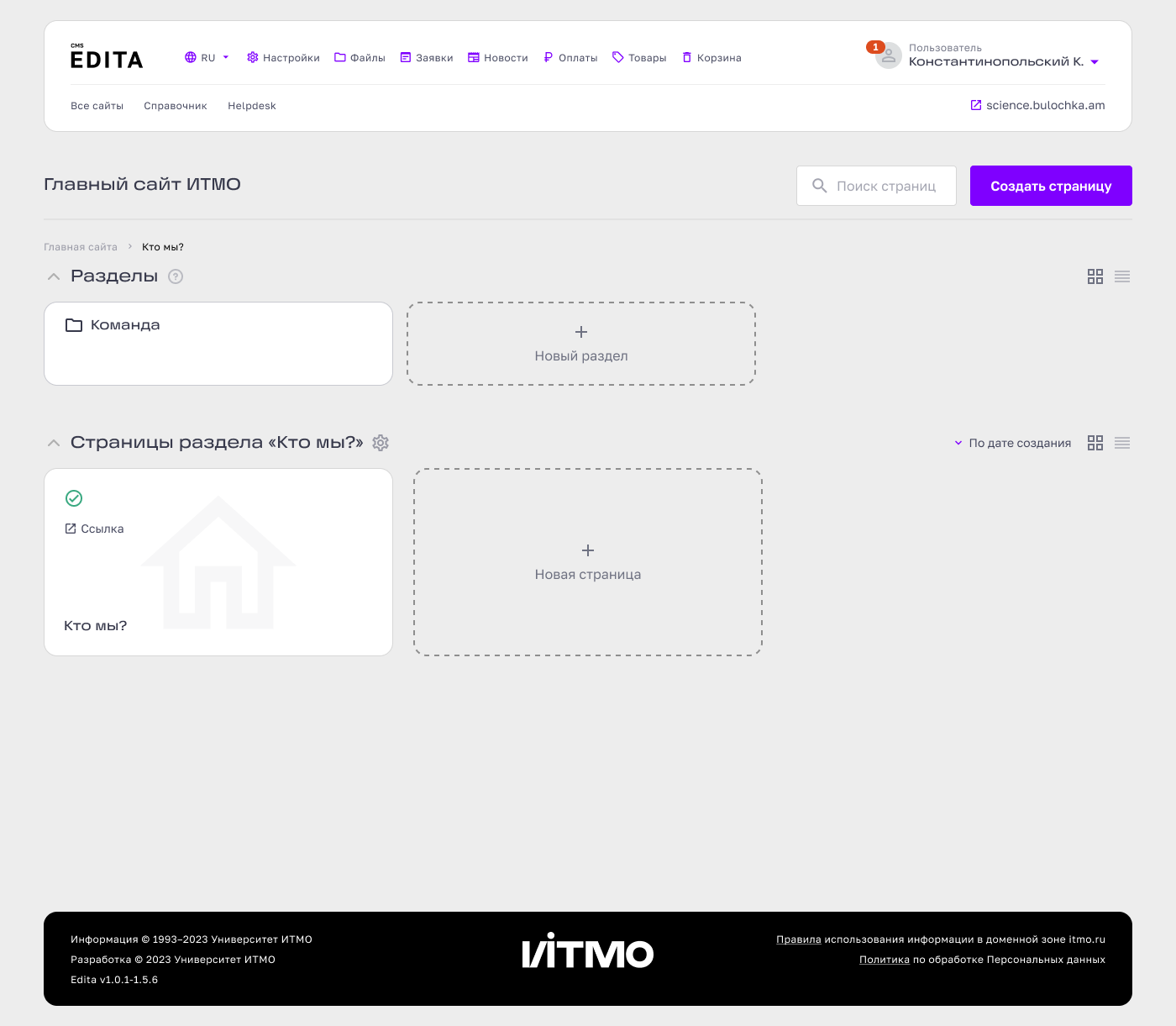
Page / section context switch
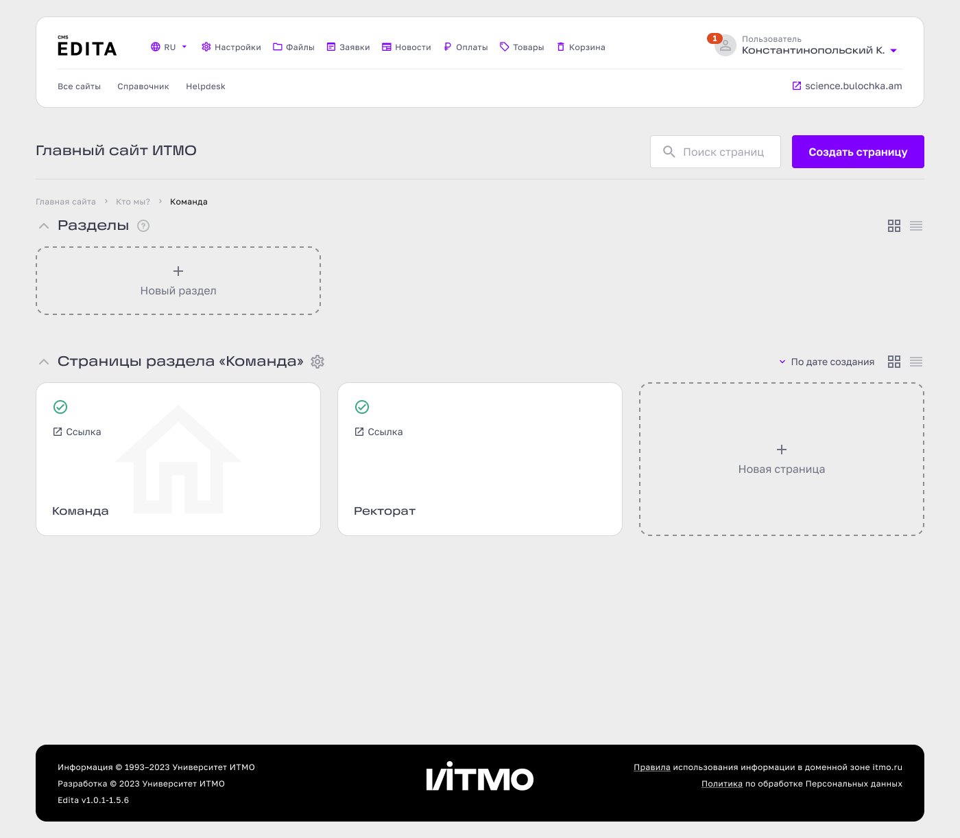
Extra layer before move
HOMEPAGE DEPENDENCY BEFORE PAGE MOVE
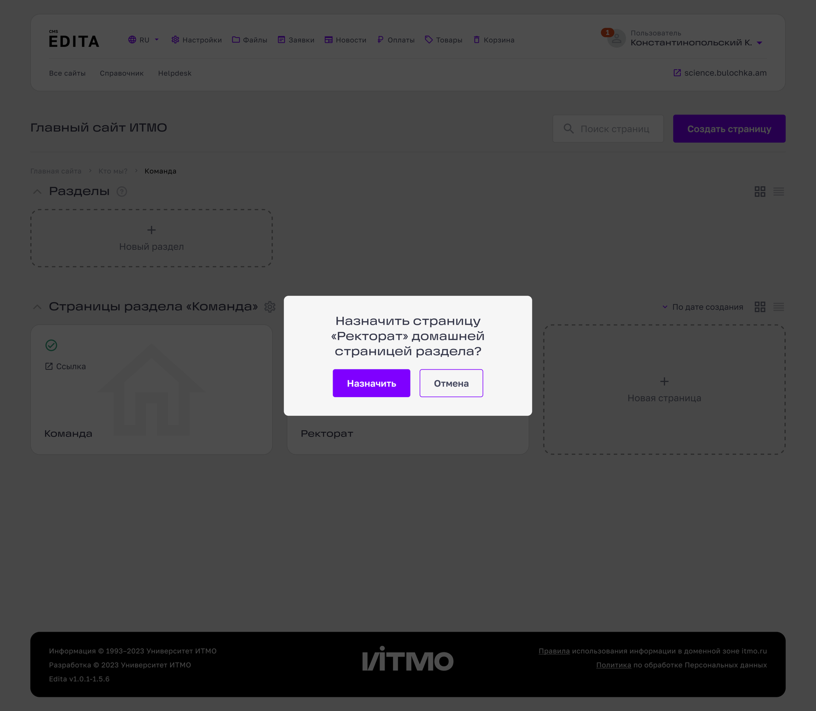
Manage pages, not technical sections
I reframed the model around the object editors actually wanted to manage: the page. In the proposed model, the CMS would generate the technical section structure automatically.
EXISTING MODEL
Section
Homepage assignment
Page
Nested section
Homepage
Page
Page
Page
Page
NEW MODEL
IMPLEMENTATION PENDING
Proposed: system-generated technical section logic
IMPLEMENTATION PENDING
One visible page hierarchy
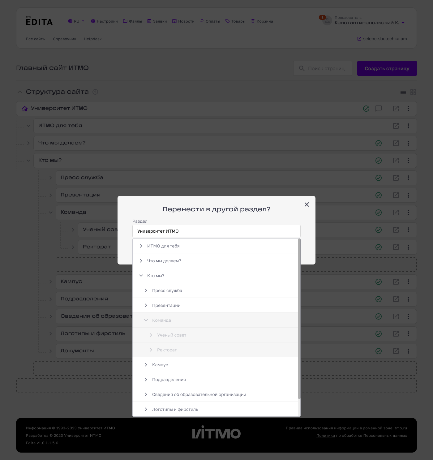
In the proposed model, editors work with a single visible page hierarchy while the CMS handles the underlying structure
Unified hierarchy
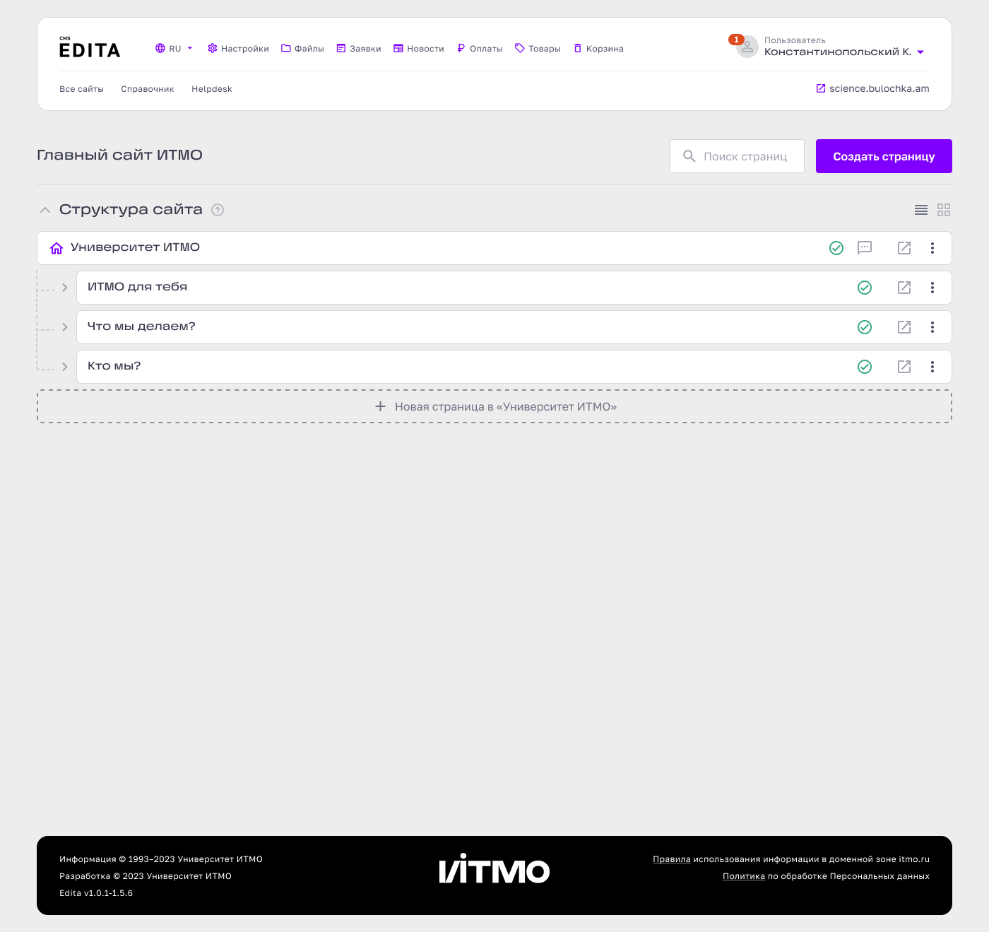
Deep hierarchy
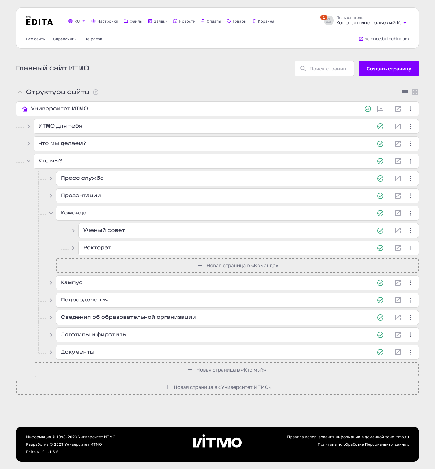
Move destination
COMPARATIVE USABILITY TEST · 3 PARTICIPANTS
Average page-moving task time
Existing model
153
sec
→
New model
30
sec
In a small comparative usability test, participants completed the page-moving task in an average of 30 seconds with the new model versus 153 seconds with the existing one.
Page-moving task time by participant
Page moving covers hierarchy, destination choice and homepage dependencies.
Research changed the disclosure control
Participants understood the hierarchy, but some missed the disclosure control. I increased its visual weight before moving forward.
BEFORE
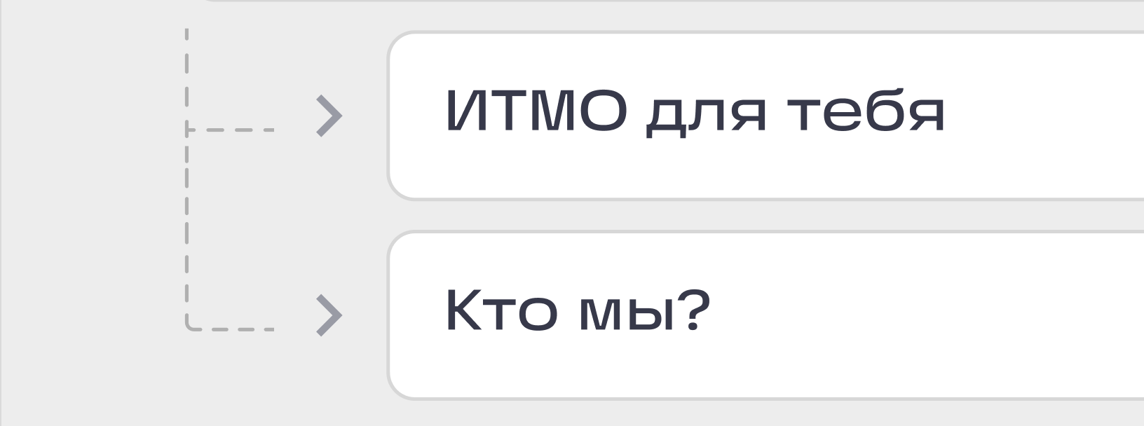
AFTER
A follow-up qualitative check with colleagues did not reveal further discoverability issues.
Accent Architecture
Colour customisation was built around predefined harmonies
The inherited model used predefined harmonies and palette combinations. Applied to full pages, I saw a scalability risk: saturated colours could compete across large surfaces.
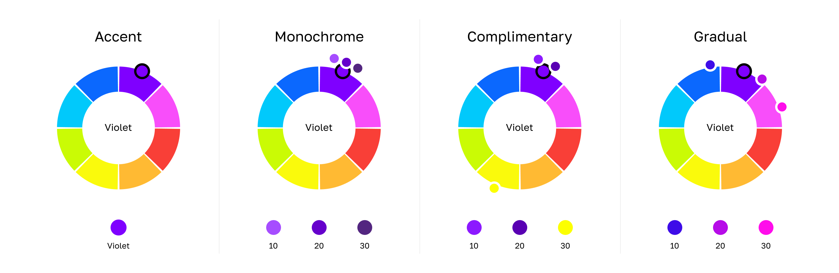
Legacy / predefined colour harmonies
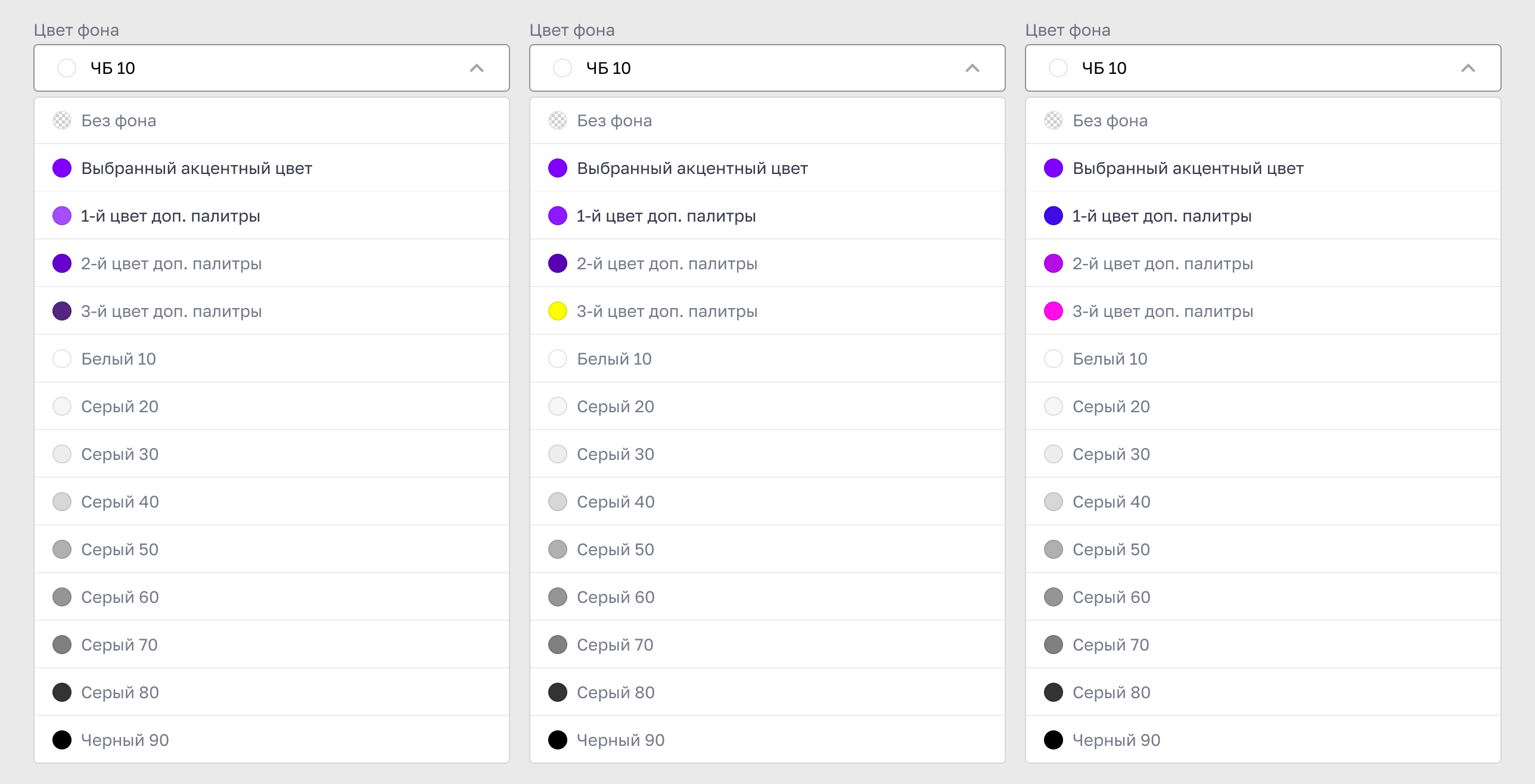
Palette combinations across presets
Palette selection could change the visual weight of entire page sections, not only the site identity
I separated site identity from surface styling
I proposed a single accent colour for interactive elements and separate tonal palettes for backgrounds and blocks. I demonstrated the approach through design comparisons, aligned it with the team and worked with developers through implementation.
SITE IDENTITY
Theme · Light / Dark
↓
Global accent
↓
Buttons · Icons · Tabs · Interactive states
≠
LOCAL STYLING
Colour family
↓
Light / Dark tonal scales
↓
Backgrounds · Surfaces · Block styling
Solid · Gradient
Saturated accent colours remain controlled system roles rather than arbitrary surface colours
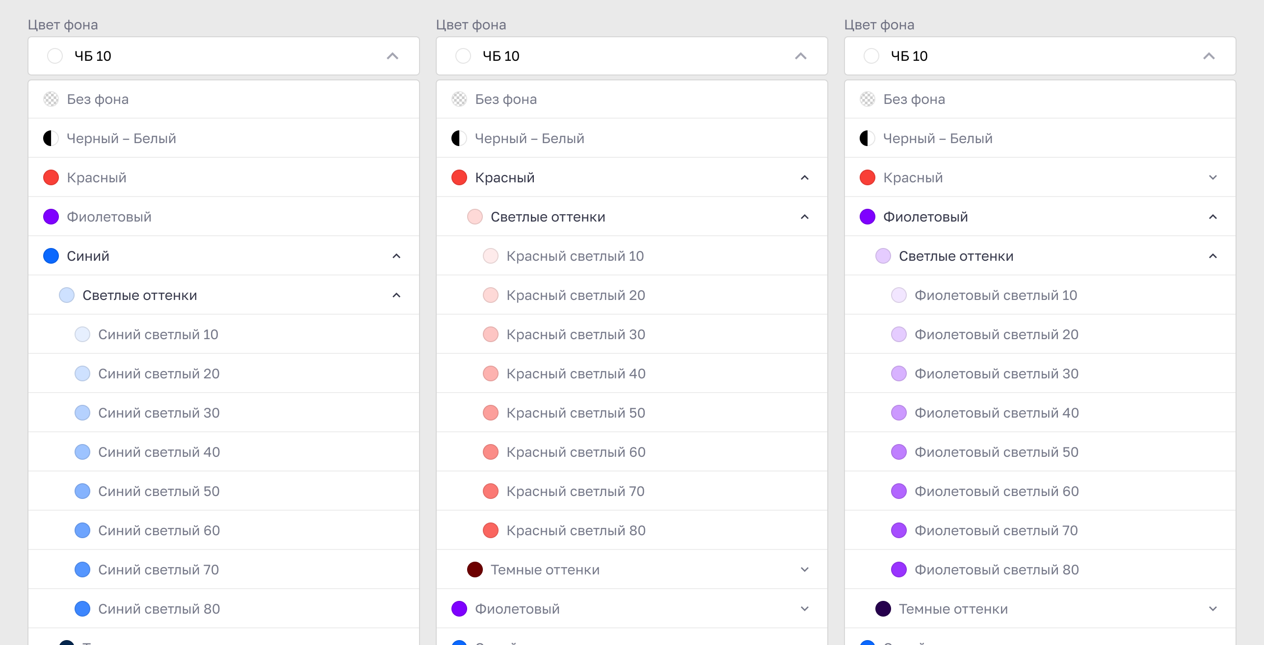
Same content, controlled colour roles
BEFORE
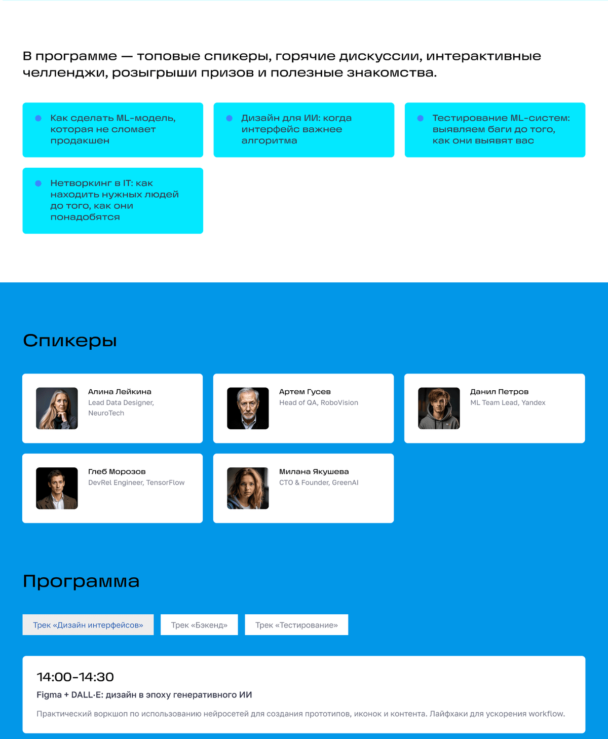
Styling relied on a limited set of predefined palettes.
AFTER
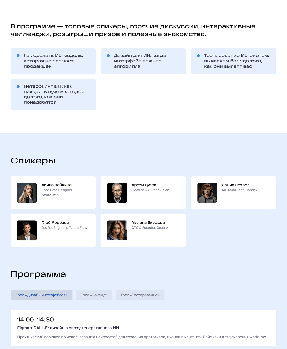
A shared accent colour and separate tonal palettes offer more flexibility across page and block styles.
SHIPPED
Accent controls in the authoring environment
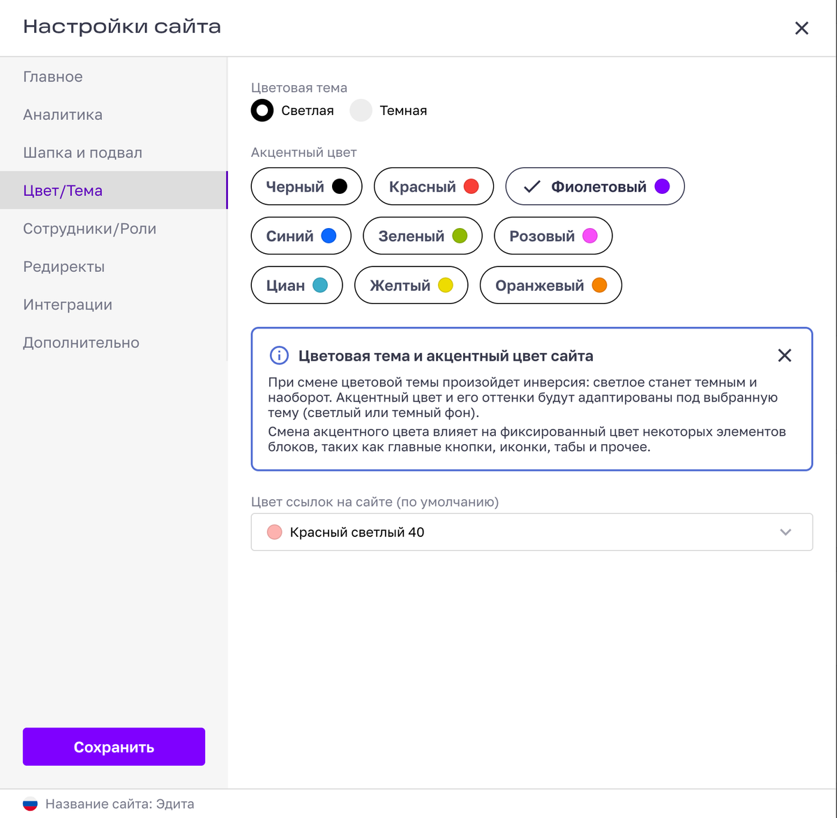
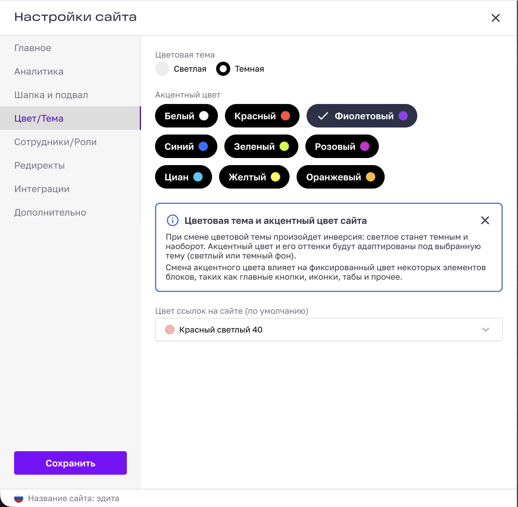
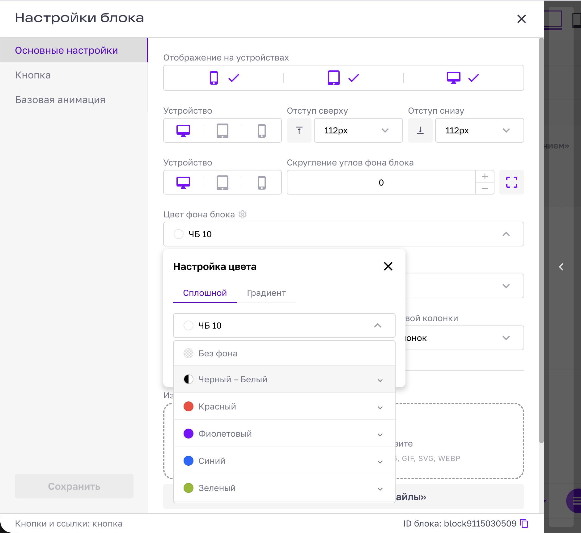
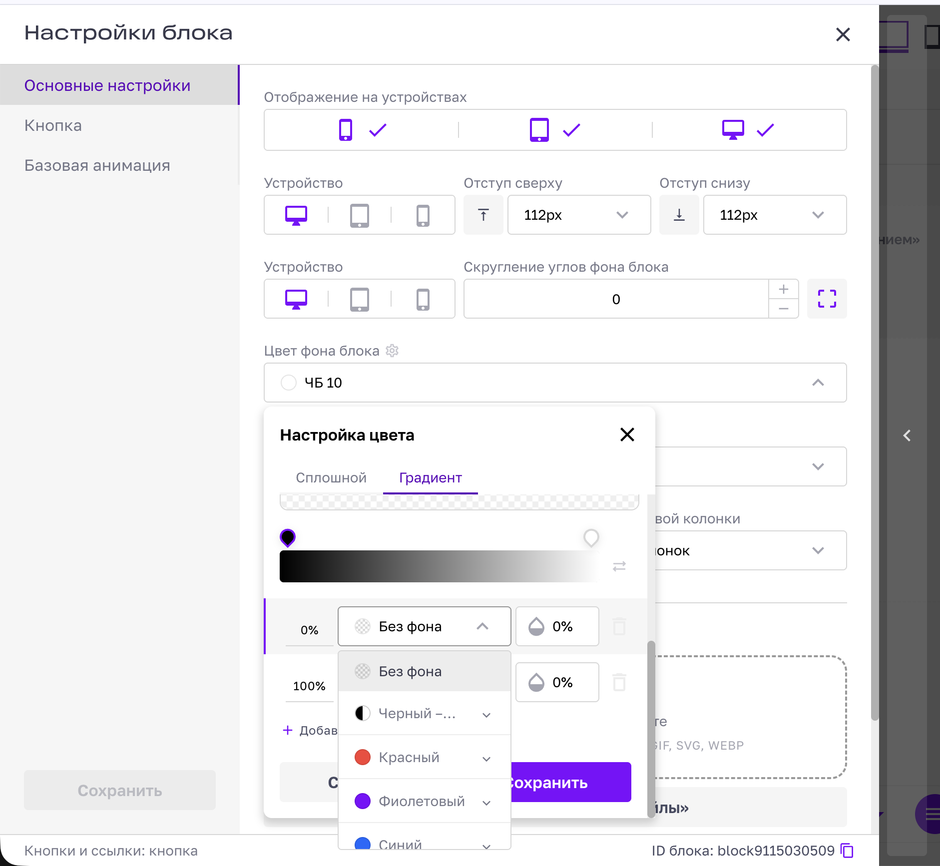
The new model shipped in Edita and is exposed through site and block settings. Site authors can choose a theme and global accent while individual blocks use controlled colour scales, solid colours and gradients.
Site settings: Light theme
Site settings: Dark theme
Block palette
Gradient settings
Two decisions: simplify page structure and separate site identity from local styling
Different live sites, one colour architecture



What I’d measure next
Structure
Repeat the study with a broader sample after release and track success rate, structural errors and support cases around nested content
Customisation
Observe how site authors combine accent and surface controls across real projects
Self-service
Measure how far internal teams can build and publish without design or support assistance